Byrne on Album Art
Here's an interesting post from David Byrne (yes, that David Byrne) about nostalgia for album art and the manner in which the association of images with popular music has evolved over the decades, and how it might evolve in the present-and-future Age of the Download.
Excerpts: There are those who mourn the vanishing of the nice big cardboard packages that vinyl came in. The format allowed fairly large images, credits, and photos. The usual assumption is that much of this imagery, like music videos, is a reflection of, and extension of, the music creator’s sensibility. As if the packaging and the videos were usually under the direct control of the author. This is absurd. Though pop artists attempted to wrestle control of the way they were presented from the distributors beginning in the 60s, most LPs design, and music videos as well, are directed and designed under the control of the record companies... ...Our sense of the author and the music being represented and embodied graphically is imaginary. We see the music and its package as all of a piece. This of course is what good packaging does. Salty snacks and washing detergents are sold mostly based on their brightly colored packaging. Most people don’t make this assumption about books — we don’t assume that the cover of a book is a visual representation of the writing, as imagined by the author, but with music we sometimes do make this leap. Hence the love of LP sleeves… and even CD booklets.
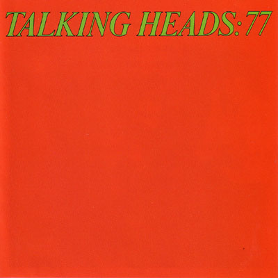
The images that I associate with Mr. Byrne and his colleagues are sometimes notable for their minimalism, including the cover of Talking Heads: 77 and the assembling of the set on a bare stage after the concert was already in progress in Stop Making Sense. (Talking Heads had no rock-and-roll spaceships that I know of, à la Boston, Journey, ELO, etc.)
Sounds a lot like the discussion that stemmed from the recent Kevin Kelly article that I mentioned a few days ago, doesn't it?
* Mr. Byrne needs a hyphen between "large" and "breasted" to convey his meaning properly. Apart from that, I'd love to see what Mr. Alpert's art consultants could have done with the technologies speculated about above. (BTW, here's HA'sTB WC&OD Re-Whipped.)
Excerpts: There are those who mourn the vanishing of the nice big cardboard packages that vinyl came in. The format allowed fairly large images, credits, and photos. The usual assumption is that much of this imagery, like music videos, is a reflection of, and extension of, the music creator’s sensibility. As if the packaging and the videos were usually under the direct control of the author. This is absurd. Though pop artists attempted to wrestle control of the way they were presented from the distributors beginning in the 60s, most LPs design, and music videos as well, are directed and designed under the control of the record companies... ...Our sense of the author and the music being represented and embodied graphically is imaginary. We see the music and its package as all of a piece. This of course is what good packaging does. Salty snacks and washing detergents are sold mostly based on their brightly colored packaging. Most people don’t make this assumption about books — we don’t assume that the cover of a book is a visual representation of the writing, as imagined by the author, but with music we sometimes do make this leap. Hence the love of LP sleeves… and even CD booklets.
The images that I associate with Mr. Byrne and his colleagues are sometimes notable for their minimalism, including the cover of Talking Heads: 77 and the assembling of the set on a bare stage after the concert was already in progress in Stop Making Sense. (Talking Heads had no rock-and-roll spaceships that I know of, à la Boston, Journey, ELO, etc.)


Finster, Heaven Is Worth It All, 1984
Back to the Byrne post on the role of album art in the Digital Era: Music didn’t always come in packages that presumed to represent the contents. Originally what you as a music consumer could buy was sheet music — which sometimes had the picture of the singer on the cover. Later, recordings — cylinders and 78s — usually came in generic sleeves. Only in the 50s with the advent of the Long Player did packaging that included large breasted women* and snazzy typography become commonplace. The era of graphically packaged music may have had about a 50-year run. But the era of music bundled with multimedia may have just begun... ...The role of graphic designers will change. Rather than being called upon to create one or two iconic images that are emblematic of an artist and a new product their job will be to imagine sets of links, connections and relationships…. and to make those visually enticing, fun and rewarding. I can’t imagine what exactly that might be, but it will be whole lot more than LP sleeves.Sounds a lot like the discussion that stemmed from the recent Kevin Kelly article that I mentioned a few days ago, doesn't it?
* Mr. Byrne needs a hyphen between "large" and "breasted" to convey his meaning properly. Apart from that, I'd love to see what Mr. Alpert's art consultants could have done with the technologies speculated about above. (BTW, here's HA'sTB WC&OD Re-Whipped.)


1 Comments:
oh do I remember this albumn cover...
Post a Comment
<< Home